Artwork Requirements for Plastic Card Printing Explained
Table of Contents []
- Artwork Requirements for Plastic Card Printing with Plastic Card ID
- Understanding the CR80 Card Format and Print Dimensions
- File Formats and Resolution Standards That Make or Break Your Cards
- Color Modes, Proofing, and Getting What You Expect Off the Press
- Magnetic Stripe, Chip, and RFID Artwork Placement Guidelines
- Common Artwork Mistakes and How to Avoid Them
- Ready to Print? Get Your Artwork Right the First Time with Plastic Card ID
Artwork Requirements for Plastic Card Printing with Plastic Card ID
Getting your artwork right before sending it to print is one of those things that seems straightforward - until it isn't. A logo that looks crisp on your screen arrives blurry on card stock. Colors shift. Text gets clipped at the edges. These are fixable problems, but only if you know what to prepare for. That is exactly why understanding artwork requirements for plastic card printing matters before you ever place an order.
Plastic Card ID has worked with over 100,000 customers across the United States, processing more than 50 million cards over 25-plus years. In that time, the most common source of delays and reprints comes down to artwork - specifically, files that weren't set up to meet print specifications. This guide walks you through everything you need to know so your cards come out exactly the way you envisioned them.
| Artwork Spec | Requirement | Why It Matters |
|---|---|---|
| File Format | PDF, AI, EPS, or high-res TIFF/PNG | Ensures sharp, scalable artwork |
| Resolution | 300 DPI minimum at print size | Prevents blurry or pixelated output |
| Color Mode | CMYK (not RGB) | Accurate color matching on press |
| Bleed Area | 1/8 inch (0.125") on all sides | Avoids white edge trimming errors |
| Safe Zone | 1/8 inch inside trim line | Keeps critical content from being cut |
| Card Size (CR80) | 3.375" x 2.125" | ISO 7810 standard card dimension |
| Font Handling | Outline all fonts before submitting | Prevents font substitution errors |
Understanding the CR80 Card Format and Print Dimensions
Every plastic card standard starts with the CR80 - the globally recognized ISO 7810 format measuring 3.375 inches wide by 2.125 inches tall, at 30 mil thickness. This is the same size as a standard credit card, which means it fits perfectly in wallets, badge holders, and card readers. Whether you are printing employee ID cards, loyalty cards, hotel key cards, or event credentials, the CR80 is almost certainly the format you will use.
Where a lot of first-time buyers stumble is in setting up their canvas size. Your design file needs to be built at the actual card dimensions - not a rough approximation. Designing at the wrong size is one of the most costly artwork mistakes in the print process, because scaling a finished design up or down degrades sharpness and throws off proportional relationships between elements.
Setting Up Your Design Canvas Correctly
Start your file at exactly 3.375" x 2.125" and immediately add a bleed area of 0.125 inches on every side. This brings your total canvas to 3.625" x 2.375". The bleed is a critical safety margin. During card cutting, slight shifts in the trimming process can occur, and without bleed, those shifts produce thin white borders around your card - a telltale sign of an unprepared file.
Inside the card boundary, keep all important elements - text, logos, barcodes, headings - within a safe zone that sits at least 0.125 inches from the trim edge. Any content that bleeds off the card should extend fully through the bleed zone. Background colors and images must fill the entire bleed area so there are no gaps at the card edges after trimming.
Landscape vs. Portrait Orientation
Standard cards are most often designed in landscape (horizontal) orientation, but portrait (vertical) layouts are entirely valid and increasingly popular for ID badge programs. Your printer orientation matters too - if your card design will be printed on-site using a desktop card printer like those from Evolis, Zebra, or Fargo, confirm that your printer driver is configured to match the card orientation in your software. Mismatches between design orientation and printer settings cause upside-down or sideways prints.
For cards with dual-sided printing, set up separate layers or separate files for the front and back. Label them clearly. Back-of-card layouts often include magnetic stripe placeholders, signature panels, barcodes, or legal disclaimers. These placements must follow specific positional guidelines, which the Plastic Card ID team can walk you through when you place your order.
Card Thickness and Specialty Formats
Standard CR80 cards run at 30 mil. Thicker cards at 40 mil or 50 mil are available for premium applications, but be aware that thicker cards may not feed reliably through all card printers. If you are ordering pre-printed custom cards rather than printing in-house, card thickness has no effect on your artwork requirements. However, for specialty formats like clear or frosted PVC, the artwork must be designed with transparency in mind.
Clear and frosted cards change how colors and backgrounds behave entirely. A white background on a clear card is invisible. Dark or solid design elements on clear stock look best, and white ink printing is a specialty service to ask about specifically. Die-cut cards in custom shapes require their own dieline file in addition to the print-ready artwork - this is a separate vector layer that shows the cutter where to trim.
File Formats and Resolution Standards That Make or Break Your Cards
Resolution is the single most-misunderstood element of artwork preparation. Most people work on high-resolution monitors and assume what looks sharp on screen will print sharp on card stock. This is wrong. Screen resolution is typically 72 to 96 DPI. Print resolution must be a minimum of 300 DPI - measured at the actual print size, not a scaled version of the image.
A 72 DPI image scaled up to meet card dimensions will look pixelated and blocky on the finished card. No amount of sharpening filters in editing software recovers lost resolution. Start with high-resolution source files, always. If your logo came from a website, a Word document, or a PowerPoint slide, it is almost certainly too low-resolution for card printing and will need to be recreated from a vector original.
Preferred File Formats for Card Artwork
Vector formats are always preferred when available. Adobe Illustrator (.AI) and Encapsulated PostScript (.EPS) files are the gold standard for card printing artwork because vector graphics scale to any size without quality loss. Logos, icons, text, and line art should always be supplied as vectors. PDF files are also acceptable, provided they contain embedded vector data and linked images are at 300 DPI or higher.
Raster formats like TIFF and PNG are acceptable when the file is 300 DPI at card size. JPEG files are generally discouraged because JPEG compression introduces artifacts that become visible at print size, especially around text edges and fine lines. If JPEG is your only option, use the highest quality export setting available and understand that some quality degradation may be visible in the final print.
Fonts and Typography Pitfalls
Fonts are a hidden landmine in artwork files. When you send a design file to a printer, the fonts you used must either be installed on their system or embedded in your file. If a font is missing, the software substitutes a default font - completely changing your layout. The solution is simple and non-negotiable: outline all fonts before submitting your file. Outlining converts each letter into a vector shape, eliminating font dependency entirely.
For minimum readable font size on plastic cards, stay above 6 points for body text. Finer text than that begins to lose legibility, especially in lighter colors against light backgrounds. Reverse text (white or light letters on a dark background) should be slightly heavier in weight than equivalent dark-on-light text, because ink spread during printing can close up thin letterforms.
Linked vs. Embedded Images
One of the most common causes of "missing content" errors in submitted artwork is linked images. Many design applications, including Adobe InDesign, use linked image files rather than embedding them into the document. When you package or export your file, those linked images must be included. The safest approach is to either embed all images directly into your file or package the entire project folder including all links when submitting to CPE.
If you are uncertain whether your images are embedded, export to PDF using the "Press Quality" or "PDF/X-1a" setting, which flattens everything into a single self-contained file. This is the cleanest submission format for most customers working with standard layout applications. When in doubt, call 800.835.7919 and the team will guide you through the process directly.
Color Modes, Proofing, and Getting What You Expect Off the Press
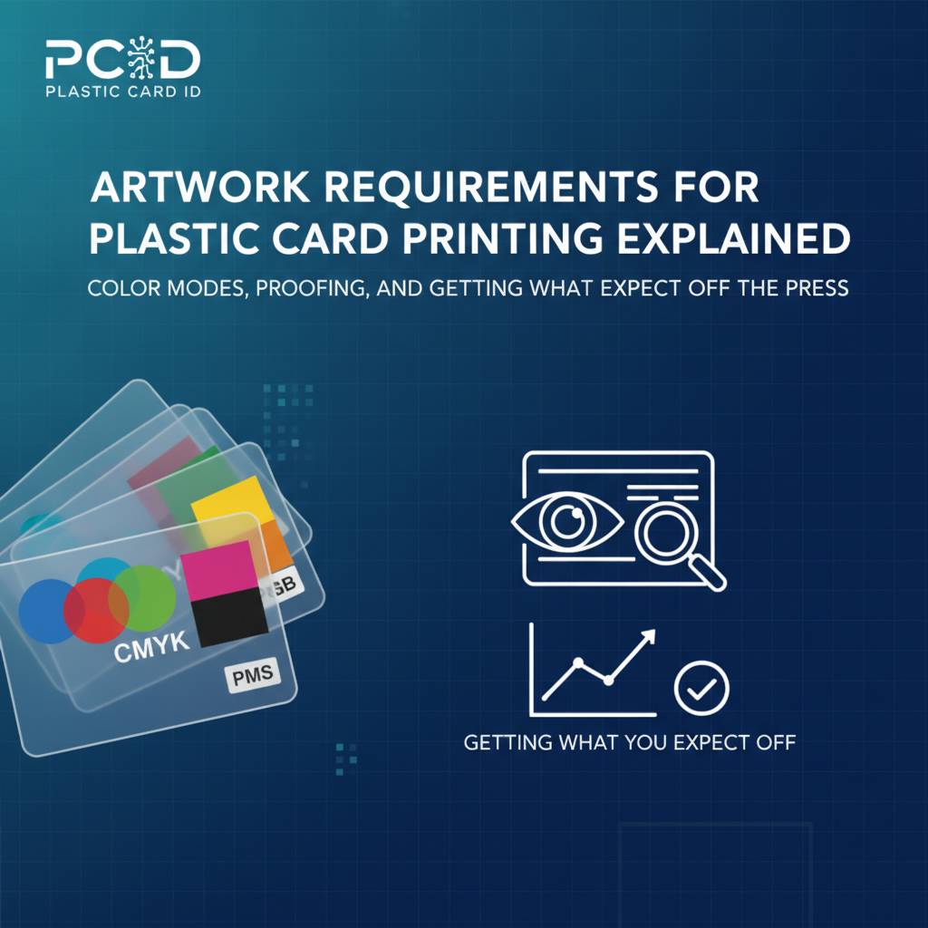 Color is where expectations and reality diverge most dramatically in card printing. The root cause is almost always a mismatch between RGB color mode (used by screens and digital cameras) and CMYK color mode (used by commercial printing presses and card printers). These are fundamentally different color systems, and an RGB file printed without conversion can produce noticeably different colors than what you designed.
Convert your files to CMYK before submission. In Adobe applications, go to Document Color Mode or Edit Color Settings and switch to CMYK. Spot colors specified in Pantone should be noted explicitly - if you need a specific brand color, call out the Pantone reference number and confirm with the production team whether spot color matching is available for your order type.
Understanding Color Shift in Card Printing
Rich black is not the same as 100% black. In CMYK printing, a single-channel black (0C, 0M, 0Y, 100K) can appear slightly gray or flat on large fills. For deep, true black backgrounds, use a rich black build such as 60C, 40M, 40Y, 100K. However, for small text, use single-channel black only - rich black on fine text causes registration blur because the four color channels can shift slightly relative to each other.
Metallic colors like gold and silver cannot be reproduced in standard CMYK. If your design calls for metallic elements, discuss specialty printing options with CPE before submitting artwork. Foil stamping and metallic inks are available as upgrade services on certain card types, including luxury metal cards in stainless steel, brass, and gold. These require additional artwork files and setup.
Digital Proofing and Approval Process
Before any card goes to mass production, Plastic Card ID provides digital proofs for customer review. This is your opportunity to confirm layout, verify text accuracy, check color approximations, and approve the position of any encoded elements like magnetic stripes or chip modules. Never skip the proofing step - once production runs, reprints due to approved-proof errors are a cost the customer absorbs.
Review proofs on a calibrated monitor in a neutral-light environment if possible. Do not review on a phone screen or in a room with strong colored lighting. Compare the proof against your brand style guide if you have one. Check spelling on every single line - card stock is unforgiving, and errors that slip through proofing do not become visible until the finished card is in your hands.
Physical Proof Requests
For large card orders - particularly membership programs, hotel key programs, or casino player card rollouts in the tens of thousands - a physical sample proof is worth requesting. Physical proofs show you exactly how colors render on the specific PVC stock being used, how foil or specialty elements look in person, and whether card thickness meets your needs. This is a small investment that can prevent a very expensive mistake at scale.
Turnaround times for physical proofs vary depending on order complexity. Ask about proof timelines when placing your initial inquiry. For programs running 50 cards a month, digital proofs are generally sufficient. For high-volume programs, the extra time spent on a physical proof is always returned in confidence and accuracy.
Magnetic Stripe, Chip, and RFID Artwork Placement Guidelines
Cards that carry functional technology - magnetic stripes, smart chips, RFID antennas, or proximity modules - have strict positional requirements that your artwork must work around. These are not design suggestions. They are engineering constraints. A magnetic stripe that is printed over renders a card non-functional. A chip module placed in the wrong quadrant will not seat properly in readers.
ISO standards define exactly where these elements must appear on a CR80 card. For standard magnetic stripes, the stripe runs horizontally across the card back, beginning 0.223 inches from the top edge. For smart chip cards, the chip module sits in the upper-left area of the card front. Your artwork must leave these zones clear of any print elements that would interfere with encoding or reading.
Magnetic Stripe Card Artwork Considerations
Plastic Card ID supplies both HiCo (High Coercivity) and LoCo (Low Coercivity) magnetic stripe cards. HiCo stripes are standard for applications requiring durability and resistance to accidental erasure near magnets - loyalty cards, membership cards, access credentials. LoCo stripes are typically used for short-term applications like hotel key cards. The visual appearance of both is similar - a dark stripe across the card back - but the stripe area must be excluded from printed artwork on that side.
Signature panels and back-of-card text must be positioned below or around the stripe. If your card back includes a barcode, the barcode must not overlap the stripe. Provide the CPE production team with a back-of-card layout alongside your front artwork so stripe and print positioning can be confirmed before plates or print settings are finalized.
RFID, Proximity, and Smart Card Inlay Awareness
RFID and proximity cards contain an embedded antenna that runs through the interior of the card. While this antenna is not visible from the outside, its presence means that metallic inks or foil applied over certain areas of the card can interfere with signal performance. If you are planning specialty print treatments on contactless cards, confirm with CPE which design areas are safe for foil or metallic ink application.
Smart chip cards for access control, casino player tracking, or hospitality programs may support MIFARE DESFire or other protocols. These cards look identical to standard cards from the outside, with only the gold chip module visible. Artwork for the front of a chip card must account for the module position - typically 15mm x 12mm in the upper-left quadrant - and should treat that area as a clear zone in the design.
Barcode and QR Code Artwork Standards
Barcodes and QR codes must meet specific size and contrast standards to scan reliably. For linear barcodes, maintain a minimum height of 0.5 inches and include a quiet zone (blank white space) of at least 10 times the bar module width on each side. For QR codes, minimum size is typically 0.75 inches square on a card, with a clear border of at least 4 modules wide on all sides. Never place a barcode over a textured or patterned background - scanners require high contrast between the code and its background.
Submit barcodes as vector elements or as high-resolution monochrome images at 600 DPI or higher. Raster barcodes at 300 DPI can scan, but finer bar elements may merge or break, reducing scan reliability. If your card program requires barcodes to be unique per card (sequential numbering), this is handled as a variable data job - ask CPE about variable data printing and encoding services when placing your order.
Common Artwork Mistakes and How to Avoid Them
After more than 50 million cards, the Plastic Card ID production team has seen virtually every artwork error imaginable. A few recur with remarkable consistency. Knowing these ahead of time is the difference between a smooth first order and a frustrating round of revisions.
The most frequent mistakes are entirely preventable. They are not caused by lack of design skill - they are caused by unfamiliarity with print-specific requirements that are simply different from digital or screen design norms. Here is what to watch for:
Top Artwork Errors Submitted to Card Printers
- RGB files submitted instead of CMYK - Colors shift unpredictably when RGB is converted at the print stage rather than by the designer.
- Low-resolution raster logos - Images pulled from websites or Word files are typically 72 DPI and will print blurry.
- Missing bleed - Designs built to the exact card edge with no bleed extension result in white border sliver after trimming.
- Text too close to trim edge - Any text or critical element within 0.125 inches of the card edge risks being clipped.
- Fonts not outlined - Missing fonts cause software to substitute a different typeface, altering layout and appearance.
- Incorrect card size canvas - Designing at a different size and then scaling distorts proportions and degrades resolution.
- Artwork placed over magnetic stripe or chip zone - Printed elements in functional zones interfere with card performance.
- Linked images not packaged with the file - Printer receives a file with missing images that appear as blank boxes or error indicators.
Quick Pre-Submission Checklist
Before sending your artwork to CPE, run through this checklist. It takes less than five minutes and can save you days of back-and-forth revision time. Confirm that your file is in CMYK color mode, set to 300 DPI or higher, built at CR80 dimensions with full bleed, fonts outlined, and all images embedded. Confirm that the magnetic stripe zone, chip module position, and any barcode quiet zones are respected.
Double-check your spelling - every word, every line. It sounds obvious, but card artwork goes through design review, approval, and production, and a typo can still make it all the way to the finished card if no one catches it. Read the text on your proof backward if necessary. Use a fresh pair of eyes from a colleague who wasn't involved in the design process.
Working with Plastic Card ID on Artwork Revisions
If your file comes in with correctable issues, the Plastic Card ID team will flag them clearly and work with you to get them resolved. This is part of what it means to have a strategic partner in your card program rather than just a vendor who accepts files and prints whatever arrives. The goal is always a finished card that performs exactly as intended and represents your organization with the quality it deserves.
For customers who do not have in-house design resources, ask CPE about design assistance services. Whether you need a simple ID badge layout or a fully branded loyalty card program with front and back custom artwork, having professional support at the artwork stage prevents the most common delays and ensures your program launches on schedule.
Ready to Print? Get Your Artwork Right the First Time with Plastic Card ID
Artwork preparation is not the most glamorous part of launching a card program. But it is absolutely the most consequential technical step before production begins. Every piece of guidance in this page traces back to one purpose: making sure the cards you receive are exactly the cards you designed, printed with sharp resolution, accurate colors, and full functionality on every encoded feature.
Plastic Card ID has spent decades refining the customer onboarding process to make artwork submission as smooth as possible. Whether you are placing an order for 50 custom loyalty cards or scaling up a hospitality program with tens of thousands of hotel key cards, the specifications are the same and the support is consistent. Great cards start with great artwork - and great artwork starts with knowing exactly what the press requires.
Call Plastic Card ID today at 800.835.7919 to speak with a card program specialist. Bring your questions, your design files, or just your ideas - the team is ready to help you build something worth carrying in a wallet.
Previous Page