Color Matching on Printed Plastic Cards: What to Know
Table of Contents []
- Color Matching on Printed Plastic Cards: Why It Matters More Than You Think - Plastic Card ID
- Understanding How Card Printers Render Color
- Card Stock and Its Influence on Printed Color
- Designing for Color Accuracy: Practical Tips for Card Programs
- Printer Selection and Its Impact on Color Output
- Color Matching for Specialty Card Applications
- Frequently Asked Questions About Color Matching on Plastic Cards
- Partner with Plastic Card ID for Color-Consistent Card Programs
Color Matching on Printed Plastic Cards: Why It Matters More Than You Think - Plastic Card ID
Hand someone a plastic card and their brain forms a judgment in milliseconds. Not about the text. Not about the logo. About the color. Whether it is a membership card slipped into a wallet or an employee badge clipped to a lanyard, color consistency is the silent signal that separates professional programs from amateur ones. Get it right and your brand feels polished, trustworthy, authoritative. Get it wrong and something just feels... off.
Color matching on printed plastic cards is both a science and a craft. It involves understanding how card printers interpret digital color data, how PVC substrates interact with dye-sublimation ribbon technology, and how to bridge the gap between what looks correct on a monitor and what actually emerges from the printer. For organizations running card programs of any scale, this knowledge is not optional - it is the foundation of a card program that actually represents your brand.
| Factor | Impact Level | What It Affects |
|---|---|---|
| Ribbon Type (YMCKO vs YMCKOK) | High | Color depth, black panel sharpness |
| Card Stock Color | High | Perceived hue, brightness, saturation |
| Printer Color Profile | Medium-High | Gamma, tone curve, gamut accuracy |
| Monitor Calibration | Medium | Design-to-print accuracy expectations |
| Software Color Mode (RGB vs CMYK) | Medium-High | Color rendering translation errors |
| Printhead Temperature | Low-Medium | Dye transfer consistency |
Understanding How Card Printers Render Color
Most desktop card printers - including the popular lines from Evolis, Zebra, and Fargo - use a process called dye-sublimation printing. Unlike inkjet or laser printing, dye-sublimation converts solid dye into gas, which then bonds directly into the PVC surface of the card. The result is smooth, continuous-tone color that looks photographic rather than dotted. This is excellent for portraits and gradients, but it introduces some important color behavior that designers must account for.
The ribbon used in these printers contains panels of Yellow, Magenta, Cyan, and often a K (black) panel plus an O (overlay) panel. Each color is applied in a separate pass. The printer driver software interprets your design's RGB values and translates them into the appropriate combination of YMC dye transfer intensities. This translation process - and the accuracy of the color profile embedded in the printer driver - is where color drift most commonly occurs. Understanding this chain of events puts you in control.
RGB vs. CMYK: The Color Mode Confusion
Card printers operate in RGB space. This surprises many designers who are accustomed to preparing print-ready files in CMYK for offset or commercial printing. When a CMYK file is sent to a card printer, the driver must convert it back to RGB before processing, and that double-conversion often produces muddy colors, unexpected hue shifts, or washed-out tones that bear little resemblance to what was intended.
The cleanest workflow is to design in RGB from the start. Use color values expressed in RGB (0-255 per channel) and trust the printer driver's color management to handle the rendering. If you have established brand colors in Pantone or CMYK, convert them thoughtfully to RGB equivalents before finalizing your card design files. Many professional designers keep a brand color reference document with both RGB and hex values specifically for digital and card printing applications.
How Printer Drivers and Color Profiles Interact
Every card printer comes with a driver that includes embedded color management settings. These settings determine how aggressively the printer saturates colors, how it handles shadows, and whether it applies any automatic corrections. Out-of-the-box settings are a starting point, not a final answer. Most Evolis, Zebra, and Fargo printers allow you to adjust brightness, contrast, and color saturation through their driver interfaces.
For high-volume programs or brand-sensitive applications, it is worth running a series of test prints with a color reference chart - a simple grid of your brand colors printed on actual card stock. Compare these prints under consistent lighting (ideally daylight or a 5000K light source) against your digital reference. Adjust driver settings incrementally, reprinting after each change. This process typically takes less than an hour and pays dividends across thousands of cards.
The Role of Printhead Maintenance in Color Consistency
A clean printhead is a consistent printhead. Dust, debris, and ribbon residue that accumulate on the printhead cause uneven dye transfer, producing streaks, banding, or localized color shifts across cards. These defects are often mistaken for color calibration problems when they are actually mechanical maintenance issues. CPE strongly recommends using manufacturer-approved cleaning kits on a scheduled basis - typically every ribbon change or every 500 cards, whichever comes first.
Cleaning cards and cleaning swabs remove contaminants without damaging the printhead's delicate heating elements. A well-maintained printhead not only produces more consistent color but also extends the life of the printer significantly. It is one of those unglamorous maintenance habits that separates card programs that run smoothly for years from those that accumulate expensive repair costs. Do not underestimate it.
Card Stock and Its Influence on Printed Color
White CR80 PVC card stock is the standard substrate for most card printing programs precisely because it provides a neutral, consistent base for color rendering. Think of it like printing on white paper versus cream paper - the base color shifts everything printed on top of it. A white card produces the truest representation of your designed colors, which is why blank white PVC cards remain the workhorse of in-house card programs across virtually every industry.
However, not all white cards are created equal. There are variations in whiteness (measured by CIE whiteness indices) and surface finish (glossy vs. matte) that affect color rendering. A slightly off-white or ivory-toned card stock will warm every color printed on it, making blues appear slightly green and whites appear creamy. If color precision matters to your program - and for branded programs it almost always does - source your card stock from a consistent, known supplier and verify the specifications before committing to volume orders.
Colored Card Stock and Color Layering
Colored blank cards - available in options like blue, red, green, yellow, gold, silver, and more - create interesting design possibilities but introduce significant color matching challenges. When you print yellow over a blue card, you get green. When you print a skin-tone on a red card, you get something unexpected entirely. Colored card stock works beautifully for programs where the card's base color is intentional and the printed design works with rather than against it.
Clear and frosted PVC cards introduce yet another variable - the background color of whatever is behind the card becomes part of the visual experience. These specialty substrates require design approaches that account for transparency. They are striking when done well and confusing when color relationships are not thought through. If you are exploring colored or specialty stock for your card program, print samples before committing to bulk quantities. The investment in test cards is minimal compared to the cost of a large order that misses the mark.
Glossy vs. Matte Surface Finish
Surface finish affects how printed color appears to the human eye. Glossy surfaces intensify perceived saturation and make colors appear richer and more vibrant under light. Matte or frosted surfaces diffuse light reflection, producing colors that appear softer, slightly less saturated, and more elegant to some viewers. Neither is objectively better - the right choice depends on your brand aesthetic and card application.
For employee badges and ID cards, matte finishes reduce glare under fluorescent office lighting, making text and photos easier to read at a glance. For loyalty and gift cards displayed in retail environments, high-gloss finishes attract the eye and convey premium quality. If your card program spans multiple card types, establishing separate design templates for glossy and matte stock and adjusting color values accordingly will ensure consistency across all card types in your program.
Contacting CPE for Card Stock Guidance
Choosing the right card stock is easier when you have an experienced team behind you. 800.835.7919 connects you directly with specialists at Plastic Card ID who understand how different substrates interact with different printer models and can help you select the right combination before you invest in quantities. This kind of consultative guidance is part of what makes the partnership valuable beyond just purchasing cards.
With over 100,000 customers served across the United States and more than 50 million cards sold, the team has encountered virtually every color matching challenge you might face. They can draw on real-world experience rather than theory to point you toward solutions that have worked for programs similar to yours, from small nonprofit membership programs running 50 cards a month to retail chains producing loyalty cards in the tens of thousands.
Designing for Color Accuracy: Practical Tips for Card Programs
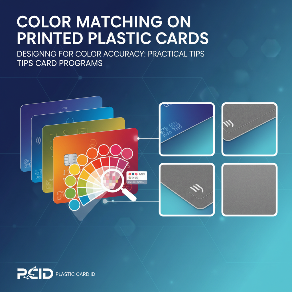 Design decisions made before a card ever reaches a printer have a profound impact on color matching outcomes. The most technically proficient printing setup cannot rescue a design file that was built without awareness of how card printing behaves. Investing time in the design phase - specifically around color specification and file preparation - dramatically reduces the back-and-forth of reprints and adjustments down the line.
One of the most common mistakes in card program design is relying on how colors appear on screen as the benchmark for final output. Monitor calibration, ambient lighting conditions, and display technology all affect what you see. A calibrated monitor is a powerful tool - but even a perfectly calibrated display is only a close approximation of what dye-sublimation printing will produce on PVC. The only true benchmark is a test print on the same card stock you will use in production.
Working with Brand Color Standards
If your organization uses Pantone Matching System (PMS) colors for brand standards, you will need to translate those values into RGB for card printing. Pantone provides official RGB and hex equivalents for their colors, but be aware that some Pantone colors - particularly certain neons, metallics, and deep saturated hues - fall outside the gamut that dye-sublimation printing can reproduce. In these cases, finding the closest achievable approximation and documenting it as your card program's brand color standard is the professional approach.
Create a simple one-page color reference document for your card program: list each brand color with its Pantone number, RGB value, and hex code, alongside a small printed swatch from an actual card. Update this document whenever you change printers, card stock suppliers, or ribbon vendors, since any of these changes can shift your color output even when the digital values remain constant. This kind of color documentation is the mark of a mature card program.
Setting Up Test Print Protocols
Establishing a test print protocol is not bureaucracy - it is quality control. Before any production run, print a small test batch of five to ten cards using your current design files and current supplies. Evaluate these test cards under consistent lighting against your color reference standard. If they pass, proceed with production. If they do not, adjust and test again. This two-step process adds minutes to your workflow and saves hours of frustration.
- Always use the same batch of card stock for test prints that you will use in production.
- Evaluate test cards under a consistent light source - natural daylight or a 5000K bulb.
- Compare against a physical color reference, not just your monitor.
- Document driver settings for every production run so you can replicate successful results.
- Run a new test batch whenever you install a new ribbon batch or switch card stock.
- Keep rejected test cards as a reference for what you are trying to avoid.
Handling Gradients and Photos in Card Design
Dye-sublimation excels at gradients and photographic imagery because it produces continuous tone rather than a halftone dot pattern. This is actually a significant advantage over many other printing technologies for card applications involving portraits (employee ID cards, membership cards) or complex brand imagery. However, very subtle gradients - particularly near-white to white transitions or very dark shadow gradients - can lose detail or shift unexpectedly depending on printer driver settings.
For best results, avoid extremely low-contrast gradients near the white end of the spectrum. If your design includes a photo, ensure it is high resolution (at least 300 DPI at print size) and color-corrected in RGB before importing it into your card design software. Compressed or low-resolution images introduce artifacts that are particularly visible in skin tones and sky backgrounds - areas where smooth tonal gradation is expected and any deviation is immediately noticeable.
Printer Selection and Its Impact on Color Output
Not all card printers produce color equally. The three major brands carried by Plastic Card ID - Evolis, Zebra, and Fargo - each have distinct characteristics in color rendering, and within each brand, different models offer varying levels of color control and output quality. Understanding these differences helps you match the right printer to your program's requirements.
Entry-level card printers are excellent for programs where color consistency is important but extreme precision is not mission-critical - think loyalty cards, basic membership cards, or event credentials. Mid-range and professional-grade printers offer finer color control, higher resolution printing, and more sophisticated driver software for programs where brand color accuracy is non-negotiable. For organizations printing employee photo ID cards where portrait quality and color fidelity matter for both security and professionalism, the investment in a better printer pays for itself quickly.
Evolis Printers: Color Characteristics
Evolis printers are known for their reliability and consistent color output, making them a popular choice for organizations running ongoing card programs. Models like the Primacy 2 and Zenius offer strong color management tools within their driver software and produce vibrant, accurate colors when properly configured. Their YMCKO ribbon system delivers crisp graphics and smooth photo quality on standard white CR80 cards.
Evolis printers also offer excellent support documentation for color calibration, and their proprietary software allows for fine-tuning brightness, contrast, and color balance. For programs that print both color graphics and monochrome text in the same print session, the black K panel on YMCKO ribbons produces sharper, denser text than using the YMC combination to render black, which is a detail that experienced card program managers quickly appreciate.
Zebra and Fargo: Color Management Options
Zebra card printers are favored in enterprise environments for their durability and integration with existing IT infrastructure. The ZC300 and ZC100 series offer solid color output and straightforward color management through Zebra's driver interface. For higher volume programs requiring consistent color across large production runs, Zebra's retransfer printers offer edge-to-edge color coverage and exceptional image quality, particularly on specialty card substrates like RFID and smart chip cards where the surface is not perfectly smooth.
Fargo printers, now part of the HID Global family, are particularly strong in security credential applications and offer some of the most sophisticated color management features available in desktop card printing. Their HDP (High Definition Printing) retransfer technology prints to a separate film that is then laminated to the card surface, producing extraordinarily consistent color that is independent of minor surface imperfections in the card stock. For programs where color precision and card security features must coexist, Fargo is a serious consideration.
Choosing the Right Ribbon for Your Color Goals
The ribbon you use is as important as the printer you choose. For full-color cards, YMCKO ribbons are the standard - Yellow, Magenta, Cyan, black panel, and overlay. The overlay panel applies a clear protective coating that locks in the printed image and adds durability. YMCKOK ribbons add a second black panel for programs that print significant amounts of black text and want maximum sharpness in text elements without sacrificing full-color capability.
For programs that only need to print monochrome data - a simple name and employee number on a pre-printed card, for example - monochrome ribbons in black, white, silver, gold, red, or blue are available at a fraction of the cost of full-color YMCKO ribbons. Understanding which ribbon type your application actually requires, rather than defaulting to full-color ribbons for everything, can significantly reduce your per-card printing cost. Reach out to 800.835.7919 for personalized ribbon selection guidance from the team at CPE.
Color Matching for Specialty Card Applications
Some card applications introduce additional color matching complexity beyond standard CR80 white stock. Casino player cards, hotel key cards, RFID proximity cards, and smart chip cards all involve card constructions that differ from simple PVC blanks, and these differences affect how color renders on the finished product. Knowing what to expect helps you plan your design and color specifications accordingly.
Hotel key cards and RFID smart cards often have a slightly different surface texture than standard blank PVC cards, owing to the embedded antenna or chip module beneath the card surface. This subtle surface variation can create minor inconsistencies in color density if printing directly over the embedded component. Retransfer printing technology largely eliminates this issue, making it the preferred approach for high-quality color printing on smart card substrates.
Luxury and Specialty Card Color Considerations
Metal cards - available in stainless steel, brass, and gold - present an entirely different color matching paradigm. Color on metal cards is typically applied through laser engraving, etching, or screen printing rather than dye-sublimation. The metallic substrate itself becomes a significant design element, and the interaction between the base metal color and applied colors requires careful design consideration. Gold and brass bases shift warm tones dramatically, while stainless steel provides a cooler, neutral base.
Clear plastic cards and frosted cards add transparency as a design variable. Any color printed on a clear card will be influenced by what is behind it when the card is held or displayed. For these specialty substrates, designing with intentional opacity levels and testing against multiple backgrounds before finalizing production quantities is particularly important. These are cards where design experimentation is part of the process, not a sign that something is wrong.
Consistency Across Large Volume Production Runs
Producing 500 cards is fundamentally different from producing 5,000. At higher volumes, ribbon batches may need to be replaced mid-run, card stock may come from different physical batches, and printhead wear accumulates. Each of these factors can introduce subtle color drift that is invisible card-to-card but noticeable when comparing the first card printed and the last card printed in a large run. Proactive quality checkpoints during large production runs - printing a reference card every 500 cards and comparing it to your standard - catch drift before it becomes a problem.
For organizations regularly producing quantities in the tens of thousands, maintaining detailed production logs with ribbon batch numbers, card stock lot numbers, and driver settings for each run creates a traceable quality record. If a color consistency issue surfaces, this documentation makes it straightforward to identify the variable that changed. It sounds like overhead, but programs that operate at this scale typically find the documentation saves significant time and material waste over the course of a year.
Frequently Asked Questions About Color Matching on Plastic Cards
Color matching questions come up consistently for organizations launching new card programs or upgrading existing ones. The answers are rarely one-size-fits-all, but there are common patterns worth addressing directly for anyone navigating this process for the first time or trying to troubleshoot an existing program.
Why Does My Card Look Different from My Screen Design?
This is the most frequently asked color matching question in card printing. The answer involves several layers: monitors emit light (additive RGB color), while printed cards reflect light (subtractive color). A color that looks bright and vivid on a backlit screen will naturally appear slightly different when printed and viewed under reflected light. Additionally, dye-sublimation printing has a specific gamut - a range of colors it can accurately reproduce - that does not perfectly overlap with everything a monitor can display.
The solution is not to find a perfect conversion formula but to calibrate your expectations and your process. Print test cards early and often. Adjust your design files to target what looks correct in print rather than what looks correct on screen. Over time, experienced card program designers develop an intuition for how to tweak digital colors to achieve desired print results on their specific printer and card stock combination.
Can I Match a Competitor's Card Colors Exactly?
Color matching to an existing physical card - whether a competitor's card, a card from a previous vendor, or an archival sample - is achievable with patience and the right approach. Scan or photograph the reference card under controlled lighting, extract the color values, and use them as your starting RGB targets in your design software. Then run test prints and compare directly under the same lighting conditions.
Keep in mind that differences in printer model, ribbon brand, and card stock between your setup and the reference card's original production setup mean you are approximating rather than duplicating. Getting within a visually acceptable match is achievable; achieving a perfect spectrophotometric match without specialized color management equipment is unlikely. For most practical applications - reordering cards after switching vendors, maintaining program continuity - a close visual match is entirely sufficient.
How Often Should I Recalibrate My Color Settings?
Recalibration makes sense whenever you introduce a new variable into your production process: new ribbon batch, new card stock supplier, printer repair or printhead replacement, new driver software version, or new design workstation. It also makes sense on a periodic basis - quarterly for programs running more than a few hundred cards per month - simply because subtle drift can occur even when nothing appears to have changed.
- After any printer maintenance or repair.
- When switching ribbon brands or starting a new ribbon batch with different lot numbers.
- After updating printer driver software.
- When changing card stock suppliers or card stock specification.
- Quarterly for ongoing programs, regardless of apparent changes.
Partner with Plastic Card ID for Color-Consistent Card Programs
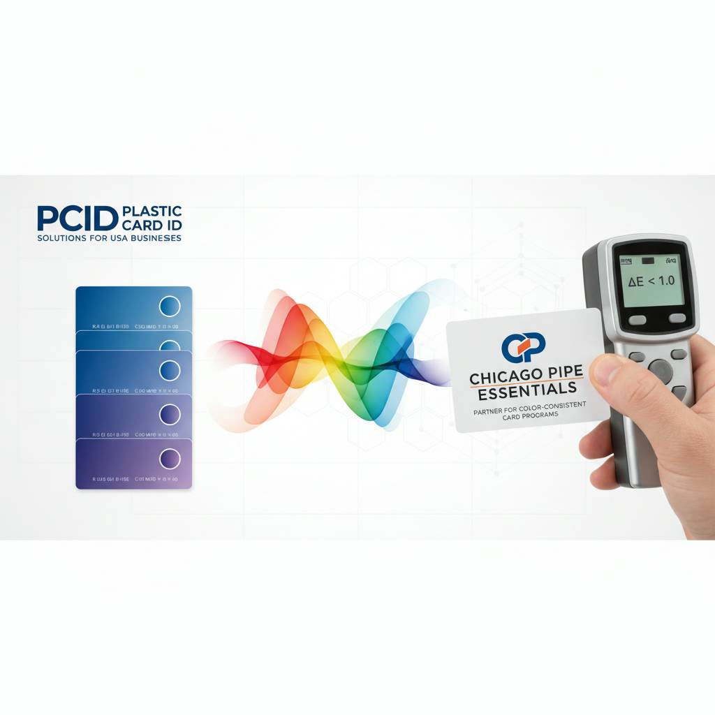 Color matching on printed plastic cards is one of those details that seems minor until it is wrong - and then it is the only thing anyone notices. Getting it right requires understanding the interaction between your design software, your printer, your card stock, and your ribbon. It requires test prints, documentation, and a willingness to iterate. And it benefits enormously from having an experienced partner who has seen these challenges at scale and can guide you through them efficiently.
CPE has spent over 25 years helping businesses across the United States build and maintain card programs that look the way they are supposed to look - print after print, run after run. From blank white CR80 cards and full-color YMCKO ribbons to specialty substrates like RFID cards, hotel key cards, casino player cards, and luxury metal cards, the product catalog is matched by genuine expertise in helping customers use those products successfully. That combination - broad product availability plus practical knowledge - is what makes the difference between a supplier and a strategic partner.
Ready to get your card program's color right the first time? Call 800.835.7919 and speak with the team at Plastic Card ID. Whether you are starting from scratch, troubleshooting an existing program, or scaling up to higher volumes, the expertise and the products you need are available right now.
Previous Page